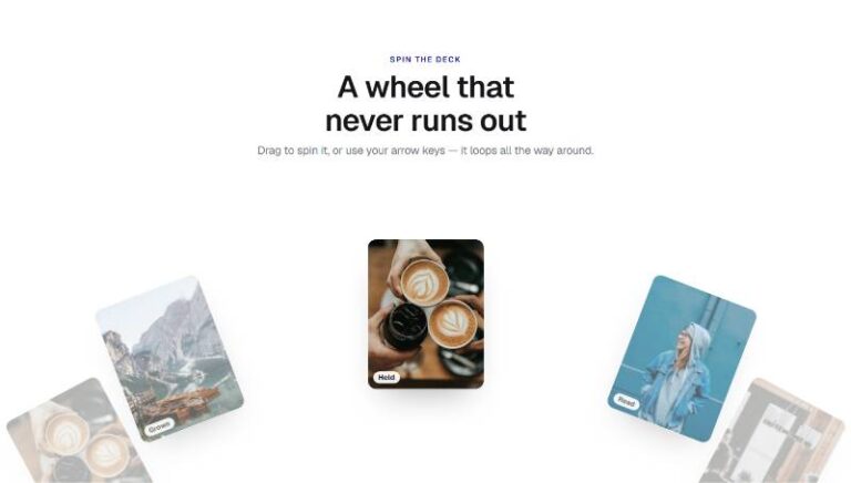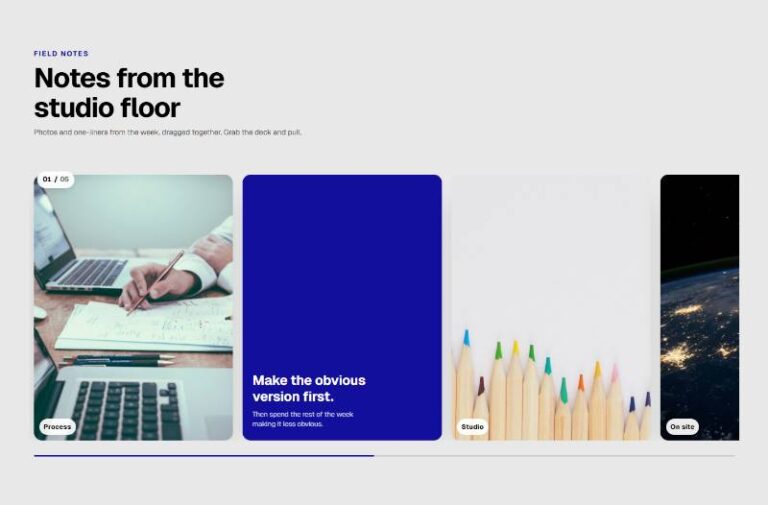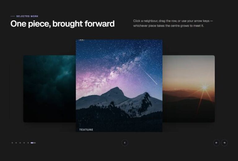


 Compare Features LandingLanding page, 1 page
 Flowline SaaS LandingLanding page, 1 page
 Prismo Creative AgencyCreative, 1 page
 Velour Car DetailingLanding page, 1 page
Vertical Hover Expand Cards
Row of compact image cards, title under each thumbnail, that grow taller on hover or keyboard focus to reveal a short description beneath — and settle back to their clean, minimal default on mouse-leave/blur. Plain edita…
50 sites for €79 only, Compare all plans
The system behind it
One pattern, your whole brand.
Vertical Hover Expand Cards reads your ACSS tokens, so changing a color, a font or a spacing value once restyles it everywhere. No hard-coded values, nothing to override.
- Type
- Component
- Category
- Cards
- Responsive
- Desktop to phone
- Works with
- Etch, ACSS, plain CSS
Options 2
Set on the section, in Etch’s attributes panel. No code needed.
data-columnshow many cards sit per row at the widest container size
data-expandpx · how much extra height the description area adds on expand
Component props 1
Only the repeating unit is a component. Duplicate, reorder or delete it in Layers and edit these props.
imagehttps://images.unsplash.com/photo-1481487196290-c152efe083f5?w=480
imageAltClose-up of a hand adjusting warm studio lighting
titleWeb Design
descriptionInterfaces built around your content, not a template that fights it.
href#web-design
Included in Pro From €39 a year, with all 469 patterns.
Get Pro