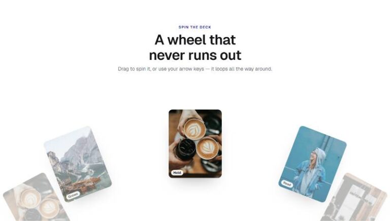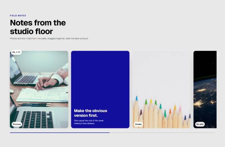


 Compare Features LandingLanding page, 1 page
 Flowline SaaS LandingLanding page, 1 page
 Prismo Creative AgencyCreative, 1 page
 Velour Car DetailingLanding page, 1 page
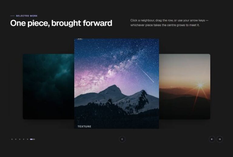
Rise Showcase Carousel
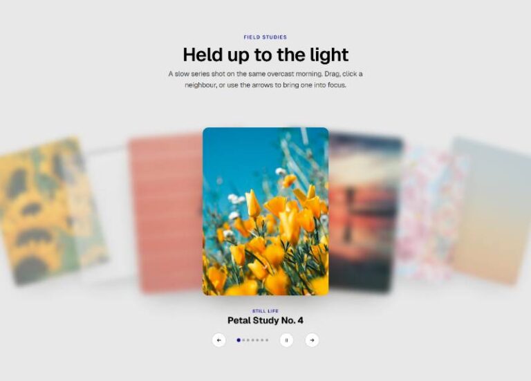
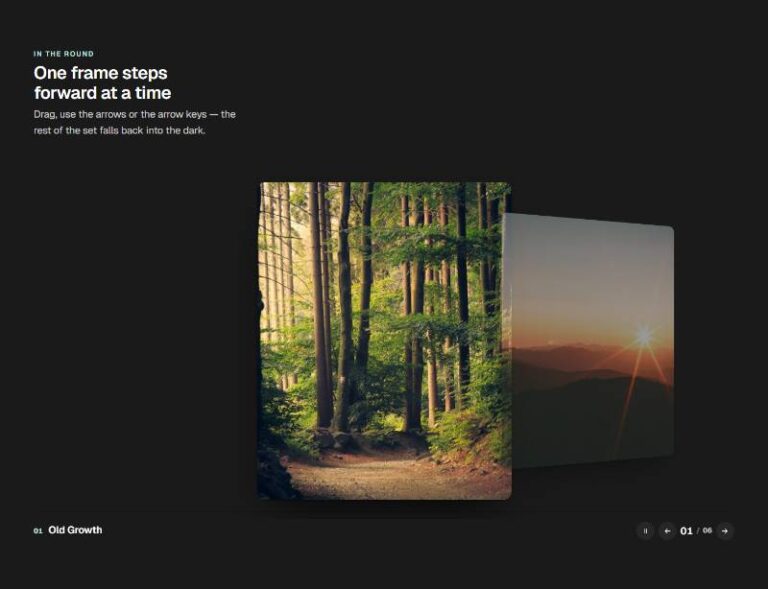
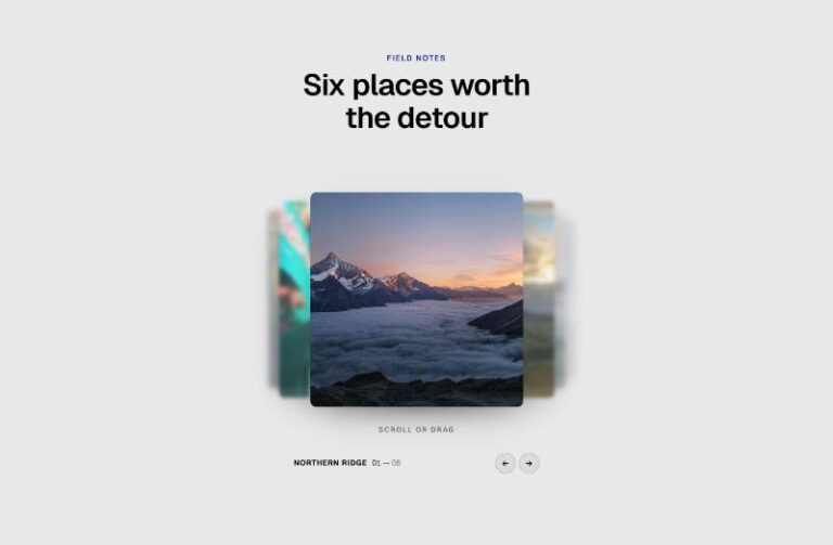
Plain editable section (eyebrow, heading, intro) holding a Swiper carousel of project cards: every card always shows its image and a small tag pill, but only the centred, active card rises above the row and opens its hea…
50 sites for €79 only, Compare all plans
The system behind it
One pattern, your whole brand.
Rise Showcase Carousel reads your ACSS tokens, so changing a color, a font or a spacing value once restyles it everywhere. No hard-coded values, nothing to override.
- Type
- Component
- Category
- Sliders and carousels
- Responsive
- Desktop to phone
- Works with
- Etch, ACSS, plain CSS
Options 7
Set on the section, in Etch’s attributes panel. No code needed.
data-liftpx the active card rises above the row
data-inactive-scaleside cards' scale
data-gappx between cards
data-autoplayand
data-delayms
data-arrowsand
data-paginationComponent props 1
Only the repeating unit is a component. Duplicate, reorder or delete it in Layers and edit these props.
imagehttps://images.unsplash.com/photo-1497215728101-856f4ea42174?w=760
imageAltA map before the sprint — project photo 1
tagStrategy
headlineA map before the sprint
textSix weeks of research condensed into a plan the whole team could rall…
linkLabelView case
linkUrl#case
Included in Pro From €39 a year, with all 469 patterns.
Get Pro