

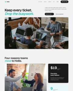
 Compare Features LandingLanding page, 1 page
 Flowline SaaS LandingLanding page, 1 page
 Prismo Creative AgencyCreative, 1 page
 Velour Car DetailingLanding page, 1 page
Content Cards Slider
Feature-card carousel built as a plain, fully editable Etch tree: section > container > header (eyebrow, h2, intro) > Swiper track > six "Feature Card" component instances > controls (dot pagination, pause/play, prev/nex…
50 sites for €79 only, Compare all plans
The system behind it
One pattern, your whole brand.
Content Cards Slider reads your ACSS tokens, so changing a color, a font or a spacing value once restyles it everywhere. No hard-coded values, nothing to override.
- Type
- Layout
- Category
- Content
- Responsive
- Desktop to phone
- Works with
- Etch, ACSS, plain CSS
Options 1
Set on the section, in Etch’s attributes panel. No code needed.
data-themeon the section
Component props 1
Only the repeating unit is a component. Duplicate, reorder or delete it in Layers and edit these props.
headingLightning Fast
bodyOur optimized infrastructure ensures sub-second load times for all yo…
linkLearn More
href#
iconPath1M13 2 3 14h7l-1 8 10-12h-7z
iconPath2empty
Included in Pro From €39 a year, with all 469 patterns.
Get ProMore patterns