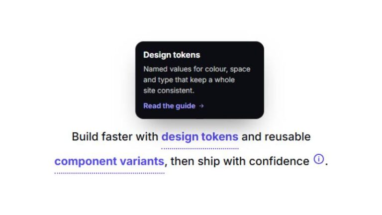

 Compare Features LandingLanding page, 1 page
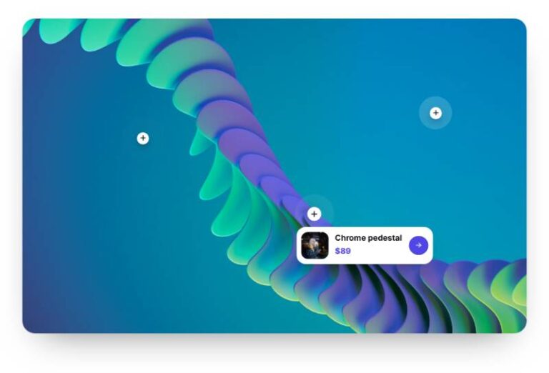
 Flowline SaaS LandingLanding page, 1 page
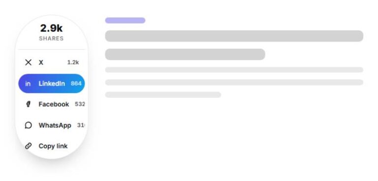
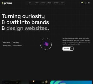 Prismo Creative AgencyCreative, 1 page
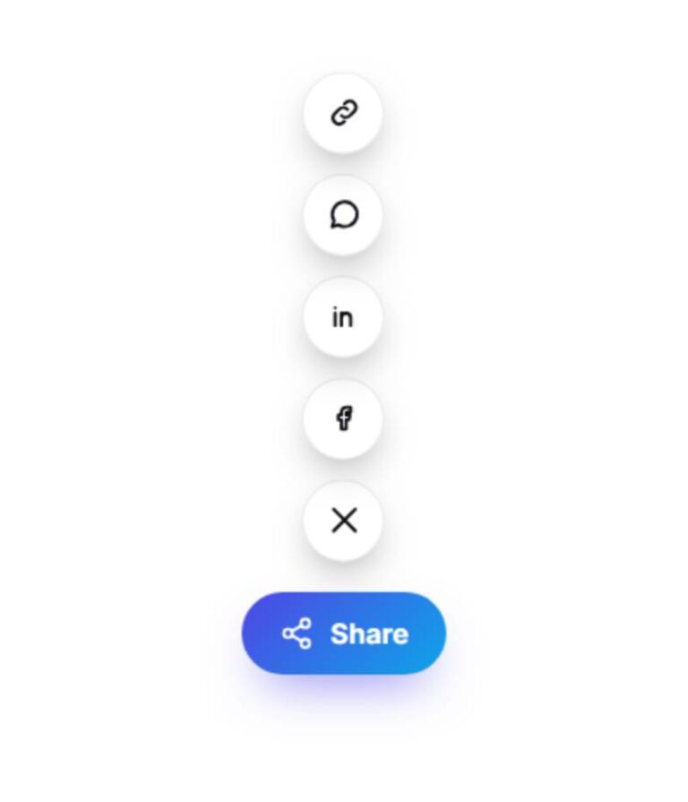
 Velour Car DetailingLanding page, 1 page
Diagonal Button
Diagonal hover effect as a ready Button component. Pure CSS with ACSS colour tokens: the Tone prop picks the palette preset (primary, dark, light, accent, success, warning, danger, neutral), and every hover behaviour is…
Get this with ProIncluded in your plan
50 sites for €79 only, Compare all plans
The system behind it
One pattern, your whole brand.
Diagonal Button reads your ACSS tokens, so changing a color, a font or a spacing value once restyles it everywhere. No hard-coded values, nothing to override.
- Type
- Element
- Category
- Buttons
- Responsive
- Desktop to phone
- Works with
- Etch, ACSS, plain CSS
Options 2
Set on the section, in Etch’s attributes panel. No code needed.
data-themelightdark
data-alignstartcenterend
Component props 1
Only the repeating unit is a component. Duplicate, reorder or delete it in Layers and edit these props.
PropTypeDefault
labeltext
Get started
urltext
#
icontext
none
tonetext
primary
sizetext
m
shapetext
rounded
hovertext
normal
speedtext
normal
hoverTonetext
ink
textCasetext
uppercase
disabledtrue / false
False
Included in Pro From €39 a year, with all 469 patterns.
Get Pro