
 Compare Features LandingLanding page, 1 page
 Flowline SaaS LandingLanding page, 1 page
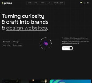 Prismo Creative AgencyCreative, 1 page
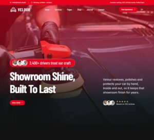 Velour Car DetailingLanding page, 1 page
Glass Button
Glass hover effect as a ready Button component. Pure CSS with ACSS colour tokens: the Tone prop picks the palette preset (primary, dark, light, accent, success, warning, danger, neutral), and every hover behaviour is a…
Get this with ProIncluded in your plan
50 sites for €79 only, Compare all plans
The system behind it
One pattern, your whole brand.
Glass Button reads your ACSS tokens, so changing a color, a font or a spacing value once restyles it everywhere. No hard-coded values, nothing to override.
- Type
- Element
- Category
- Buttons
- Responsive
- Desktop to phone
- Works with
- Etch, ACSS, plain CSS
Options 2
Set on the section, in Etch’s attributes panel. No code needed.
data-themelightdark
data-alignstartcenterend
Component props 1
Only the repeating unit is a component. Duplicate, reorder or delete it in Layers and edit these props.
PropTypeDefault
labeltext
Get started
urltext
#
icontext
none
tonetext
primary
sizetext
m
shapetext
rounded
hovertext
normal
speedtext
normal
hoverTonetext
ink
textCasetext
uppercase
disabledtrue / false
False
Included in Pro From €39 a year, with all 469 patterns.
Get Pro