
 Compare Features LandingLanding page, 1 page
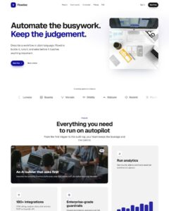 Flowline SaaS LandingLanding page, 1 page
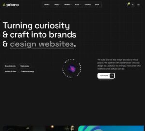 Prismo Creative AgencyCreative, 1 page
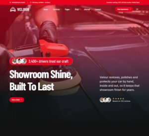 Velour Car DetailingLanding page, 1 page
Checkbox Choice Cards
Multi-select cards for onboarding, interests and add-ons: each card is a native checkbox with an icon, title and description, an animated check badge pops in, the border and tint switch on, and the card lifts. A header…
50 sites for €79 only, Compare all plans
All photos and visual assets used in this preview are sourced from Unsplash.
The system behind it
One pattern, your whole brand.
Checkbox Choice Cards reads your ACSS tokens, so changing a color, a font or a spacing value once restyles it everywhere. No hard-coded values, nothing to override.
- Type
- Element
- Category
- Checkboxes
- Responsive
- Desktop to phone
- Works with
- Etch, ACSS, plain CSS
Options 5
Set on the section, in Etch’s attributes panel. No code needed.
data-themesurface
data-colscards per row on wide screens
data-styleselected look
data-countshow the "N selected" line and the Select all link
data-animentrance
Component props 1
Only the repeating unit is a component. Duplicate, reorder or delete it in Layers and edit these props.
nameservices
valuedesign
titleBrand design
textLogo, type and colour systems.
icondesign
Included in Pro From €39 a year, with all 753 patterns.
Get Pro