
 Compare Features LandingLanding page, 1 page
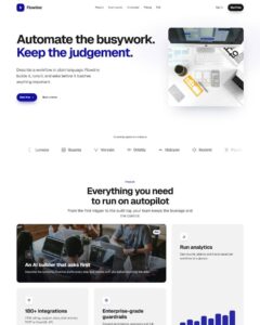 Flowline SaaS LandingLanding page, 1 page
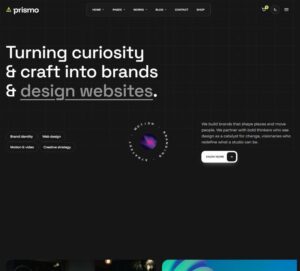 Prismo Creative AgencyCreative, 1 page
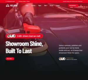 Velour Car DetailingLanding page, 1 page
CMS Project Showcase Card
Case-study grid whose card is shaped around the fields a CMS collection supplies, so each prop maps one-to-one to a dynamic binding: section > container > header (eyebrow, h2, intro, filter bar) > grid of "Project Showca…
50 sites for €79 only, Compare all plans
The system behind it
One pattern, your whole brand.
CMS Project Showcase Card reads your ACSS tokens, so changing a color, a font or a spacing value once restyles it everywhere. No hard-coded values, nothing to override.
- Type
- Component
- Category
- Cards
- Responsive
- Desktop to phone
- Works with
- Etch, ACSS, plain CSS
Options 10
Set on the section, in Etch’s attributes panel. No code needed.
data-themedata-layoutfeatured = the first visible project becomes a full-width horizontal lead card on wide screens
data-columnscards per row on wide containers
data-revealoverlay = the spec sheet wipes up over the cover on hover or focus, push = it expands under the text, always = always shown (touch devices always get it in flow)
data-aspectcover ratio
data-image-hovercover zoom on hover
data-radiuscover and panel corners
data-filtercategory filter bar built from the cards (with counts) that reflows the grid with a FLIP animation
data-durationms · filter reflow speed
data-easingComponent props 2
Only the repeating unit is a component. Duplicate, reorder or delete it in Layers and edit these props.
labelFigma
imagehttps://images.unsplash.com/photo-1551650975-87deedd944c3?w=1400
imageAltHand holding a phone showing a banking app dashboard
focalcenter
categoryProduct design
showYearTrue
year2025
showBadgeFalse
badgeAward winner
titleLedger, a banking app people open on purpose
headingLevelh3
url#ledger
showOverviewTrue
overviewWe rebuilt onboarding, payments and the home screen around the three…
showMetricTrue
metricValue+41%
metricLabelweekly active users
showClientTrue
clientLedger Bank
showRoleTrue
roleResearch, UX, UI
showTimelineTrue
timeline14 weeks
showToolsTrue
cueLabelView case study
Included in Pro From €39 a year, with all 469 patterns.
Get Pro