 Compare Features LandingLanding page, 1 page
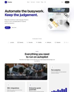 Flowline SaaS LandingLanding page, 1 page
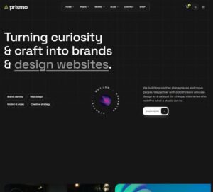 Prismo Creative AgencyCreative, 1 page
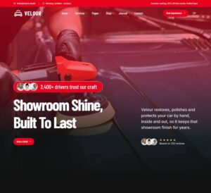 Velour Car DetailingLanding page, 1 page
EtchWP Mega Menu
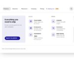
Platform header with a morphing mega menu, as a plain, fully editable Etch tree: header > container > bar (brand, nav with Products, Solutions and Resources panels plus Customers and Pricing links, Sign in, CTA, menu tog…
50 sites for €79 only, Compare all plans
The system behind it
One pattern, your whole brand.
EtchWP Mega Menu reads your ACSS tokens, so changing a color, a font or a spacing value once restyles it everywhere. No hard-coded values, nothing to override.
- Type
- Layout
- Category
- Footers and headers
- Responsive
- Desktop to phone
- Works with
- Etch, ACSS, plain CSS
Options 25
Set on the section, in Etch’s attributes panel. No code needed.
data-themedata-accentaccent token for icon tiles, badges, links and the CTA
data-positiondefault static so it never overlaps other sections
data-headroomwith sticky or fixed: hides on scroll down, returns on scroll up, adds a soft shadow once scrolled
data-aligndesktop nav placement
data-dividerhairline under the bar
data-hovertop item hover and open style
data-triggerhow panels open on desktop (click and keyboard always work)
data-close-delayms · hover intent
data-morphone shared surface that morphs between panels, or a separate card per panel
data-caretgliding caret under the open trigger
data-distancepx · how far panel content slides when switching
data-iconsicon treatment in links
data-radiusand
data-shadowfor the dropdown surface
data-animdata-durationms
data-easingor any cubic-bezier
data-overlaydims the page for the mobile drawer only, for every open menu, or never
data-drawer-sidedata-accordiondata-swipeswipe the drawer closed
data-scroll-lockdata-cta-mobileshow Sign in, the CTA, and the compact CTA in the phone bar
data-demodemo hero below the bar for previews
Component props 4
Only the repeating unit is a component. Duplicate, reorder or delete it in Layers and edit these props.
labelNew
toneaccent
labelVisual builder
url#
showDescriptionTrue
descriptionDesign pages on a live canvas
showIconTrue
iconlayout
showBadgeTrue
stylecard
showImageTrue
imagehttps://images.unsplash.com/photo-1541462608143-67571c6738dd?w=720
imageAltDesk flat lay with wireframes, a keyboard and a coffee
showEyebrowTrue
eyebrowWhat is new
titleVersion 4.2: shared design tokens
showTextTrue
textOne palette for every site. Change a token and forty pages follow.
linkLabelRead the release
url#
imagehttps://images.unsplash.com/photo-1531403009284-440f080d1e12?w=240
imageAltPaper wireframes pinned to a whiteboard
categoryGuide
titleDesign tokens without the spreadsheet
showMetaTrue
meta6 min read
url#
Included in Pro From €39 a year, with all 469 patterns.
Get ProMore patterns